
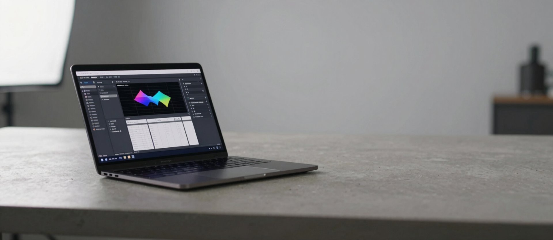
The interface that gets out of the way
Real projects, real workflows, real outcomes. Each one built by asking what the user needs to do — not what features the brief requested.
Fewer steps. Faster adoption.
From nine screens to three
A dispatch workflow spread across nine screens and four confirmation dialogs. We mapped the actual job, cut redundant steps, and shipped a three-screen path. Adoption hit 90% in week one.
Tested on real dispatch shifts before a single line of production code shipped. The workflow, not the mockup, drove every decision.
One scan, one confirmation
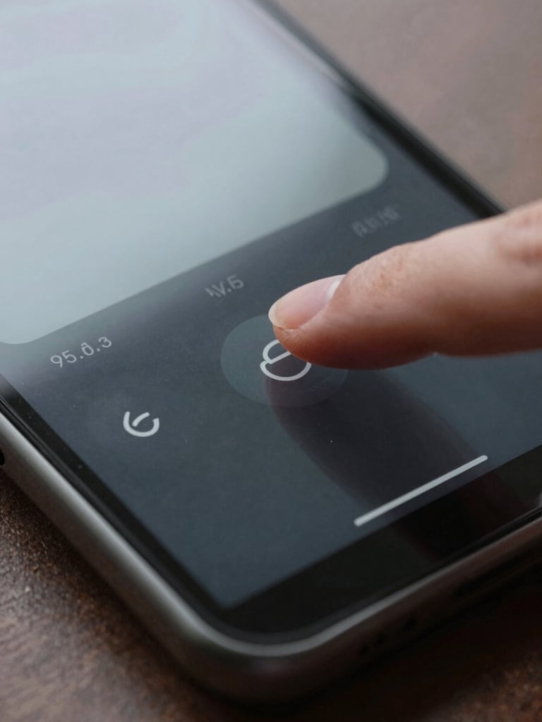
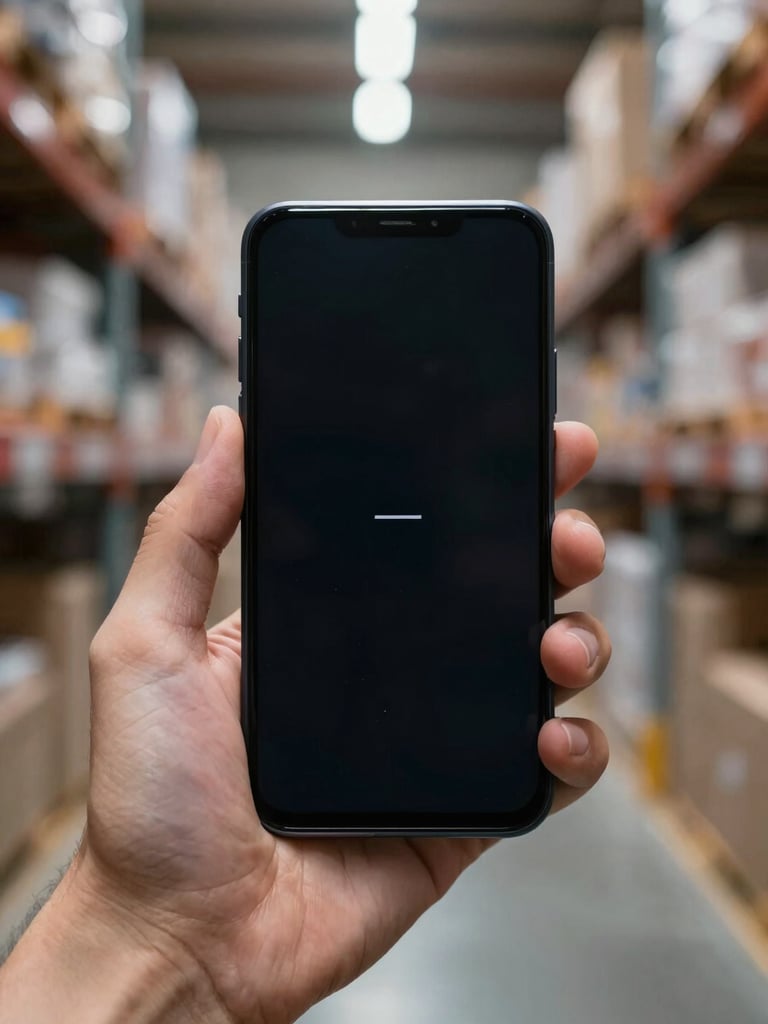
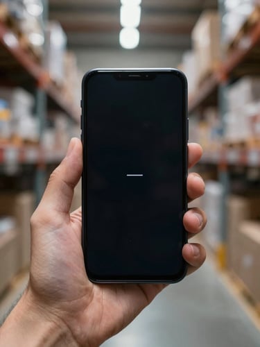
Warehouse staff were averaging 14 taps per item entry. We rebuilt the scan-to-log path around one physical action and removed every confirmation the system could make silently.
Entry errors dropped by half in the first month. The interface stopped being the obstacle.
We document the real task sequence before touching a layout. What the user does, in what order, with what constraints. The scope emerges from that map, not from a feature list.
Tested before it ships
Every screen and every tap gets challenged before it survives. We remove steps the workflow doesn't require, then build what remains.
Three phases. Each one narrows the problem before the next one opens the solution.
Prototypes run against actual workflows with actual users before production code starts. We measure task completion, not satisfaction ratings.
One path to done — starting with your project
Tell us what your users need to do. We'll tell you what stands in the way and how long it takes to clear it.